Summary View

WHAT IS IT?

The Summary View is your landing page for every new analysis—offering a clear, high-level overview of your uploaded freight data, total transportation spend, and how your pricing stacks up against the market. This is your launchpad for identifying opportunities, assessing risk, and deciding where to dig in first.

This view surfaces the most actionable insights right away, helping you prioritize which lanes and markets need attention based on how your rates compare to the SONAR market rates.

Key Metrics in the Summary View

  • Total Transportation Spend
    Your total freight cost calculated as:
    Load Volume × Linehaul Rate per Mile × Total Miles
  • Market vs. Actual
    A comparison of your total spend vs. what the same lanes would cost at market average contract rates (SONAR).
    Total Spend – Contract Market Spend = Your Net Position
  • Over Market Spend
    The portion of your spend that exceeds the contract market benchmark.
    These lanes signal:
    – Favorable conditions for shippers (loose capacity, backhaul lanes)
    – High potential for rate renegotiation or optimization
  • Under Market Spend
    The portion of your spend that is below market rates.
    These lanes often reflect:
    – Operational inefficiencies for carriers
    – Higher risk of poor service or compliance issues
  • Total Volume
    The sum of all load volume from your uploaded lanes—helping to size opportunities by impact.


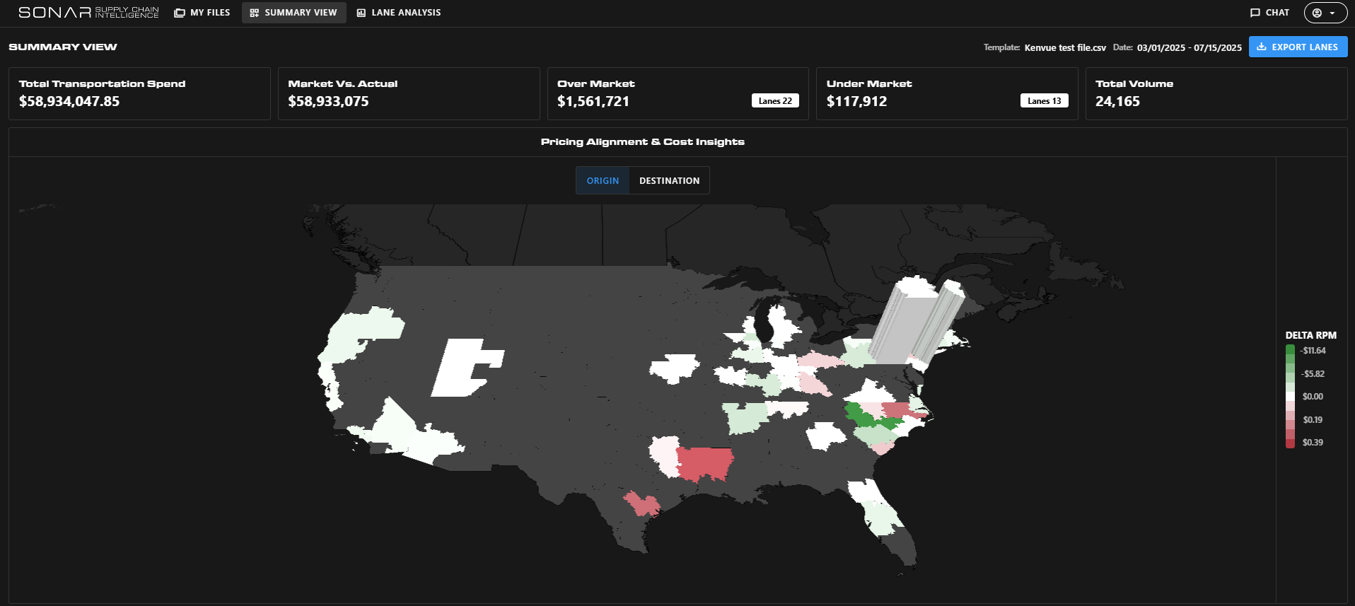
Pricing Alignment & Cost Insights Map
This interactive map allows you to visually scan your entire network for rate alignment issues:

  • Green Markets – You’re under market (cost-effective, but potentially risky)
  • Red Markets – You’re over market (costly, but ripe for negotiation)

Clicking any market on the map will take you directly to the Network View with those specific lanes selected—streamlining your workflow from insight to action.

The Summary View simplifies complexity into clarity offering a fast, actionable understanding of your freight network’s financial performance and areas for improvement. It’s the ideal place to start any analysis before exploring deeper lane or market views.

Search Knowledge Center

Other Supply Chain Intelligence (SCI) Features

KC-Icon-App-SCI-Network

Network View

KC-Icon-App-SCI-Opportunity

Lane View

Choose Another App

carrier sales

Coverage Guide

download-17

Container Atlas

KC-Icon-App-Critical-Events

Critical Events

Customer Sales.jpg

Key Market Guidance

lane-signal-icon

Excel Add-In

KC-Icon-App-Market-Dashboard

Market Dashboard

lane-scorecard-icon

Market Dashboard+

market icon

Key Market Insights

container-atlas-icon

Most Volatile Markets

KC-Icon-App-SCI-List

National Insights

imports-by-consignee-icon

SONAR Charts

KC-Icon-App-SCI-Summary

SONAR Maps

download-18

Supply Chain Intelligence (SCI)

predictive-rates-icon

Watchlists

Not Sure Where To Start?